This project was a collaboration between Deeplocal and Google to create an internal tool. The goal was to create a “Smart Home-Like” interface allowing users to control lighting, audio, visuals, and more.
Project Overview
Challenge
Develop an internal tool that allows users to adjust lighting, audio, visuals, and more.
This internal tool needs to work for 3 different types of users. Beginner, Intermediate, and Advanced users.
Solution
Create 3 different tablet interfaces for beginner, intermediate, and advanced users. I decided to break this up into L1, L2, and L3 interfaces. L1 being beginner and L3 being advanced.
L1, a beginner interface with capabilities limited to a predetermined selection.
L2, an intermediate interface that blends L1 capabilities with audio controls.
L3, an advanced interface that allows a user to combine the capabilities of L1 and L3 with master controls over multiple rooms/halls.
Role
Lead UX/UI Designer
Time
6 Months
Task
Increase engagement for Artist Recap 2024
Tools
Figma, Internal Google Research
Understanding their users
Let’s set the stage. This tool was designed to be used in St John’s Terminal, A building recently acquired by Google to be transformed into a 5 floor workspace. Their users are internal employees and guests who can have a wide range of technical experience levels. Google categorized these users into 3 groups.
L1 - These users have minimal technical knowledge and simply needed to change the displays/music in a meeting room.
L2 - These users have more technical knowledge and will have control over multiple parameters in each meeting room. This user will control audio mixing, visual displays, and lighting.
L3 - These users will have master controls over multiple rooms, displays, and audio mixing.
Side note ( The preliminary UX research was handled by Google internally.)
L1 Interface
This is the interface designed for the most basic of users. Using material design fundamentals, I integrated the requirements needed for small meeting rooms.


L2 Interface
The L2 Interface includes all the functionality of L1, but now has segmented controllers with each tab having unique controls. These screens below illustrate how each tab works.


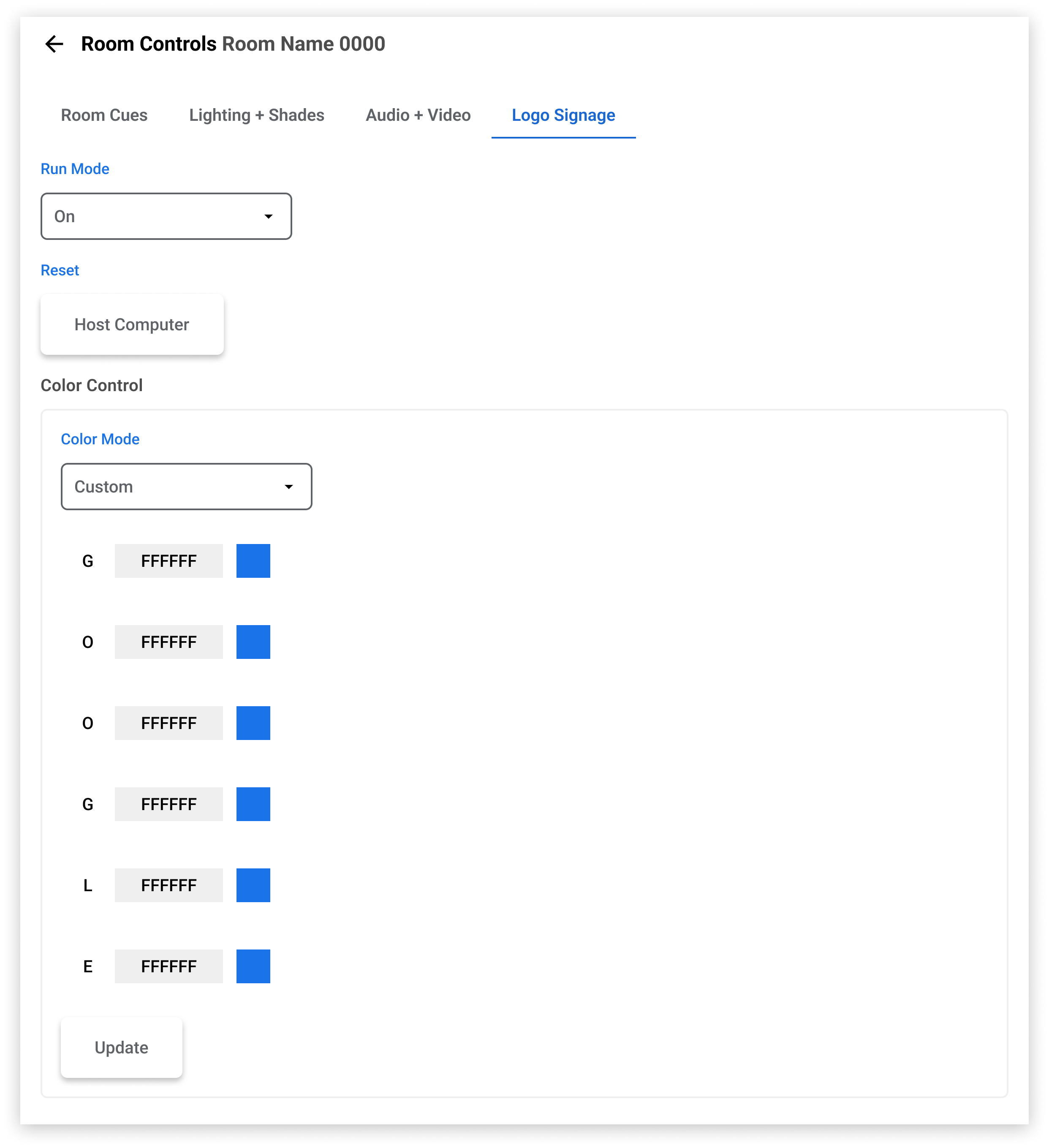
L3 Interface
Here we’re met with the advanced interface. This is where things get a bit more complicated. Each interface is tied to the specific room in the building, that being said there are too many rooms for me to add here without creating an extremely extensive case study. Below I’ll show a few variations before moving into the room selector.


Final Thoughts
With quite a few design/developer limitations I’m happy with how this project turned out. I was able to meet the base requirements of stakeholders and stay aligned with their design philosophy.
Accessibility
As I reflect on this project, I would have loved to utilize more tool tips. Sometimes internal projects ignore accessibility because they aren’t meant for the public. There are spaces where I could have pushed harder for that.
Visual Hierarchy
Some stakeholders were very adverse to a horizontal layout on certain pages (L3 specifically). I would have loved to push that structure forward since the white space feels a bit off.